The solution to sterile modernism isn’t just adding plants—it’s deploying them as strategic architectural elements that sculpt space and introduce textural vocabulary.
- Focus on the sculptural form and textural quality of botanicals, not just their color.
- Avoid « plant clutter » by embracing the « Rule of Three » or a single, impactful statement piece.
Recommendation: Instead of dotting small plants around a room, activate its entire volume by layering a tall floor plant, a mid-height arrangement, and a cascading element.
There is an undeniable purity to modern, industrial, and contemporary design. The clean lines, the honest materials like concrete and steel, and the commitment to uncluttered space create a powerful, sophisticated aesthetic. Yet, this pursuit of minimalism can sometimes lead to an environment that feels more like a gallery than a home: impressive, but cold, sterile, and lacking a human touch. The common reflex is to « add some plants » to bring life into the room. While well-intentioned, this often results in a random assortment of pots that disrupt, rather than enhance, the design’s core principles.
The conventional approach of simply contrasting hard with soft is a surface-level solution. It misses the fundamental opportunity presented by botanicals. What if the key wasn’t to merely decorate the space with plants, but to use them as a deliberate and integrated architectural material? The true potential lies in treating organic forms not as afterthoughts or accessories, but as essential tools to sculpt negative space, manipulate light, and introduce a rich, textural vocabulary that dialogues with the monolithic nature of modernism. It’s about shifting the perspective from « placing a plant in a room » to « completing the room’s architecture with a plant. »
This guide moves beyond generic advice. We will explore the principles of selecting botanicals for their structural form, not just their foliage. We will analyze how to use them to inject color with surgical precision, layer textures in a monochromatic scheme, and accessorize an entire room using only the power of organic shapes. It’s time to learn how to speak the language of architectural botany.
To navigate this architectural approach to botanicals, this guide is structured to build your expertise from foundational principles to advanced techniques. Explore the sections below to master the art of softening modern spaces with intention.
Summary: A Designer’s Guide to Architectural Botanicals
- Why Do Soft Petals Look Better Against Concrete and Steel?
- How to Choose Structure Plants That Complement Modern Furniture?
- Real or Faux: Which Works Better in a High-Gloss Modern Kitchen?
- The Clutter Error That Destroys the Zen of Modern Decor
- How to Inject Color into a Greyscale Room Using Only Flowers?
- Why Is Less More When Styling Modern Coffee Tables?
- White on White: How to Layer Textures Without Adding Color?
- How to Accessorize a Minimalist Living Room Using Only Botanicals?
Why Do Soft Petals Look Better Against Concrete and Steel?
The powerful aesthetic of placing a delicate bloom against a raw concrete wall goes far beyond simple contrast. It’s a dialogue of texture, form, and light. Modern materials like polished concrete, high-gloss lacquer, and brushed steel possess a monolithic, uniform surface. They reflect light predictably and offer little in the way of intricate detail. An organic form, like a flower or a leaf, does the opposite. Its surface is complex, with veins, folds, and subtle imperfections that catch and diffuse light in a thousand different ways. This creates a point of high visual complexity that the eye is naturally drawn to in an otherwise uniform environment.
This principle is at the heart of biophilic design, a field dedicated to connecting building occupants more closely to nature. The global biophilic design market is projected to reach US$3.14 billion by 2028, a testament to the growing recognition of nature’s critical role in man-made environments. As the experts at Unsolicited Plant Talks note in « The Art of Interior Design with Live Plants, » the effect is foundational: « Plants have a natural ability to soften the overall look of every interior…balancing out the sharp lines and angles of furniture and décor. »
The most sophisticated application of this principle involves not just the plant itself, but the shadow it casts. A single, directional light source can turn a simple stem into a dynamic art installation, painting a complex, moving pattern of soft curves across a hard, static wall. This interplay transforms a flat surface into a three-dimensional canvas.
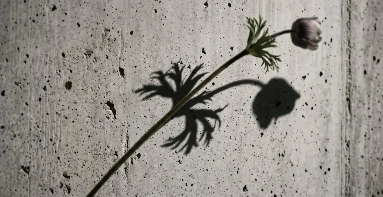
As this image demonstrates, the shadow becomes an architectural element in its own right. It introduces an organic pattern without adding clutter, a way of « decorating » with light and form. The sharp, clean lines of a modern interior are not erased but are instead given a counterpoint, a moment of organic poetry that makes the entire composition more compelling and emotionally resonant. The hardness of the steel or concrete makes the softness of the petal feel more profound, and vice-versa.
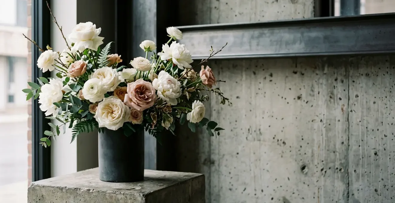
How to Choose Structure Plants That Complement Modern Furniture?
In a modern interior, a plant should not be considered mere « greenery. » It must be selected with the same rigor as a piece of furniture or a light fixture, primarily for its architectural form. The goal is to choose a botanical that either echoes or provides a deliberate, graceful counterpoint to the clean lines and geometric shapes of modern design. Instead of a soft, bushy form that can look messy, seek out plants with a strong, defined silhouette that holds its own as a living sculpture.
Think of plant selection in terms of architectural categories. This framework allows you to choose a form that serves a specific design purpose within the room’s composition:
- Vertical Forms (Column Mimics): Plants like the Snake Plant (Dracaena trifasciata) with its upright, sword-like leaves create powerful vertical lines that complement the height of modern spaces and echo architectural pillars.
- Arching Forms (Curve Mimics): The graceful, arching leaves of a Spider Plant (Chlorophytum comosum) or the cascading movement of a Pothos (Epipremnum aureum) introduce organic curves that beautifully balance the rigid, right-angles of contemporary sofas and consoles.
- Sculptural Forms (Standalone Art): A Fiddle Leaf Fig (Ficus lyrata) or a Monstera Deliciosa, with its iconic leaf cutouts, actively shapes the negative space around it. These are not background elements; they are focal points that function as standalone art pieces.
The right pairing can elevate both the plant and the furniture, creating a cohesive and intentional design statement. This strategy is about creating a relationship between objects in a space.
Case Study: Mid-Century Modern Pairing Strategy
Design experts often recommend pairing the Bird of Paradise (Strelitzia nicolai) with mid-century modern furniture. This style is defined by its clean lines, geometric shapes, and natural materials. The plant’s massive, banana-like leaves possess a bold, unique structure that complements these principles perfectly. When positioned prominently in a corner near an accent chair, the plant’s distinctive foliage acts as a statement piece, its organic form echoing the era’s design ethos without competing with it.
Ultimately, the plant becomes an extension of the design language. By focusing on structure, you ensure that the botanical element is not a random addition but a crucial part of the architectural narrative, enhancing the very lines you seek to soften.
Real or Faux: Which Works Better in a High-Gloss Modern Kitchen?
The modern kitchen, with its high-gloss surfaces, integrated appliances, and minimalist hardware, presents a unique challenge for botanicals. It is often a space of fluctuating temperatures, varying humidity, and sometimes limited natural light. This makes the « real versus faux » debate particularly relevant. The decision should not be based on a purist ideology but on a pragmatic assessment of placement, purpose, and quality.
There is no denying the intrinsic benefits of living plants. As the team at The Sill explains, the advantages go beyond the visual: « Real plants have been proven to increase happiness and creativity, reduce stress… and cleanse the air. » However, they also note that « artificial plants provide ease and simplicity and allow you to reap all the same visual benefits. » In a high-traffic, function-first space like a kitchen, this ease can be a significant asset. A wilting, unhealthy plant on a pristine quartz countertop detracts from the modern aesthetic far more than a high-quality faux alternative.
The key to using artificial botanicals successfully in a high-end space is an uncompromising commitment to quality. The market is flooded with cheap plastic options that will instantly cheapen a sophisticated design. A designer’s approach requires a focus on material hierarchy and strategic placement:
- Premium Materials: For prominent displays, seek out custom faux botanicals made from silk, velvet, or other material-conscious substitutes that offer realistic textures and natural color variations. These are often visually indistinguishable from their real counterparts.
- Strategic Mixing: The most effective strategy is often a hybrid one. Use real, thriving plants in accessible, well-lit areas where they can be appreciated up close—a small herb pot on the windowsill, a striking orchid on the island. Reserve high-quality faux plants for hard-to-reach or inhospitable spots, such as the top of cabinets or in dark corners, to add a touch of green without the maintenance burden.
- Quality Indicators: A superior faux plant will have subtle imperfections, varied leaf coloration, and a solid construction. Avoid anything with a uniform, glossy plastic finish, which is the primary indicator of a low-quality product.
In the high-gloss modern kitchen, the goal is a flawless aesthetic. Whether real or faux, the chosen botanical must look pristine. A strategic mix allows you to enjoy the wellness benefits of real plants where they will thrive and the reliable beauty of faux plants where they are most practical.
The Clutter Error That Destroys the Zen of Modern Decor
The single greatest mistake in applying botanicals to a modern interior is succumbing to « botanical clutter. » Minimalism, the philosophical core of modernism, is about the intentional and powerful use of a few well-chosen objects. A collection of many small, unrelated pots scattered around a room creates visual noise, undermines the sense of calm, and directly violates this principle. The effect is one of scatter, not style. Each small plant competes for attention, and the overall impact is diluted to zero.
The contemporary design world is actively moving away from this cluttered « jungle » aesthetic towards a more curated, architectural approach. In fact, the biggest trend for 2026 is moving away from plant clutter and toward using fewer, larger specimens that define a space. The solution is to think like a curator, not a collector. Instead of asking « Where can I put another plant? », ask « What is the minimum number of botanicals needed to make the maximum impact? » The answer often lies in the classic design principle, the « Rule of Odds. »
Arranging items in odd numbers—one, three, or five—creates a more dynamic and visually pleasing composition than even-numbered groupings. This rule is exceptionally effective for plant styling:
- The Single Statement: One large, dramatic plant (like a Fiddle Leaf Fig) or a single oversized tropical leaf in a simple vase can anchor an entire room. It acts as a living sculpture and a powerful focal point.
- The Group of Three: Clustering three plants of varying heights and forms creates an intentional « wellness corner » or a dynamic tabletop arrangement. This small-scale grouping feels deliberate and contained, not random.
- The Group of Five: For larger surfaces like a long console, arranging five small plants in tight clusters of two and three maintains a sense of order and balance, drawing attention to their unique qualities while preserving negative space.
Avoiding botanical clutter means choosing impact over inventory. A single, perfectly placed plant that respects the architecture of the room is infinitely more powerful than a dozen that ignore it.
Your 5-Step Botanical Curation Audit
- Point of Contact Audit: List every single surface and corner where you currently have a plant (windowsills, tables, floors, shelves).
- Inventory Collection: Group all your plants together in one spot. This visual inventory will immediately reveal redundancies in size, shape, and pot style.
- Coherence Check: Confront this collection with your home’s core aesthetic. Do these plants and pots align with a « clean, structural, and intentional » vision, or do they feel random and accumulated?
- Impact vs. Noise Grid: For each plant, quickly rate its impact. Is it a unique, sculptural form (impact) or just another small, generic pot of green (noise)? Be ruthless.
- Integration Plan: Re-introduce only the « impact » plants, following the Rule of Three or the Single Statement principle. Find new homes for the « noise » plants (or group them into one larger, more impactful planter).
How to Inject Color into a Greyscale Room Using Only Flowers?
A monochromatic greyscale interior is a sophisticated canvas, but it can sometimes feel emotionally cool or one-dimensional. The common impulse is to add a « pop of color, » but this approach often results in an isolated, jarring element that feels disconnected from the rest of the space. A more architectural method is to treat floral color not as a random accent, but as a deliberate tool to adjust the room’s psychological temperature and create a cohesive, layered narrative.
Even without vibrant blooms, the simple presence of green foliage can have a profound effect. As research has shown, shades of green can help people feel relaxed and improve well-being, providing a subtle organic counterpoint to man-made greys. However, when using flowers for a more pronounced color statement, advanced color theory techniques ensure the result is integrated and chic, not chaotic:
- The Color Echo Technique: Instead of a single, loud pop of color, select one bold floral hue and then « echo » it in a much subtler way elsewhere in the room. A bouquet of deep red roses on a console table, for example, can be echoed by a book spine or a small detail in a piece of art across the room. This creates a sophisticated visual thread.
- Tonal and Saturation Layering: Create immense depth and richness without adding more colors by using the exact same hue in different tones and saturations. An arrangement combining pale pink roses, mid-tone carnations, and deep magenta peonies feels complex and luxurious, not busy.
- Psychological Temperature Adjustment: Consciously use color to alter the mood. In a room dominated by cool greys and chrome, an arrangement of warm floral colors—oranges, yellows, deep reds—can effectively raise the psychological temperature, making the space feel more inviting and welcoming.
The vessel is as important as the flowers. A vase that matches the color of the surrounding furniture will create a subtle, blended look where the focus is purely on the flowers. Conversely, a vase in a contrasting color or material will draw the eye and make the entire arrangement a more powerful focal point.
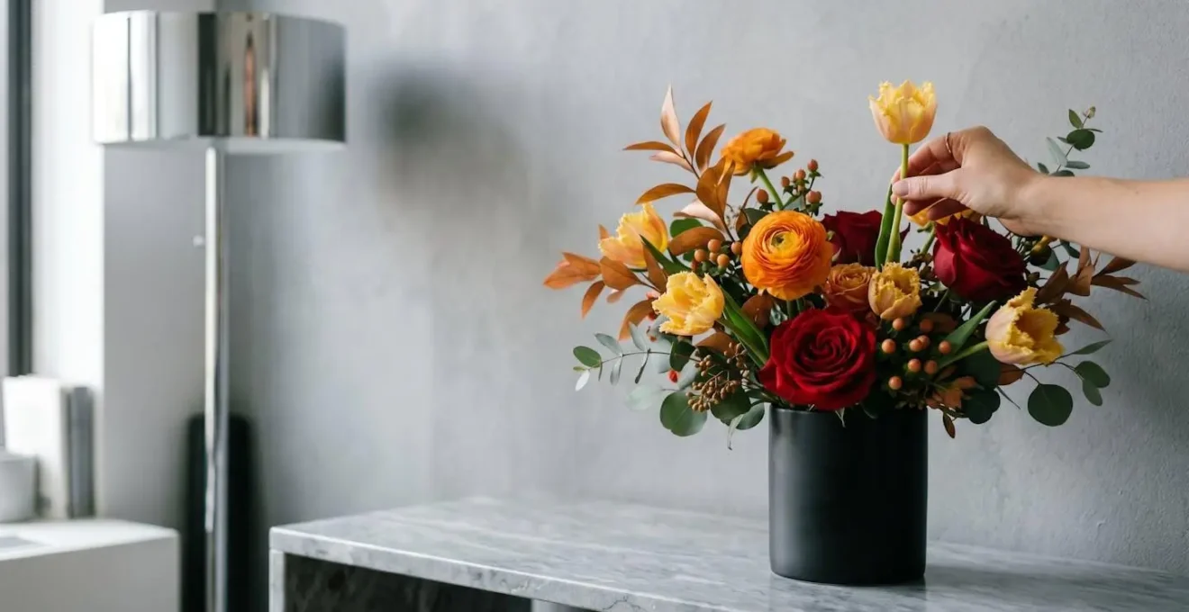
By applying these techniques, color is no longer a random act. It becomes a strategic design choice, a way to paint with petals to fine-tune the emotion and harmony of a modern, greyscale space.
Why Is Less More When Styling Modern Coffee Tables?
The coffee table is the epicenter of a modern living room. It’s a functional surface, a social hub, and a key aesthetic statement. In minimalist design, its styling is a litmus test for the « less is more » philosophy. A cluttered coffee table is not only unusable but also creates a focal point of visual chaos that undermines the tranquility of the entire room. The goal is to create a composition that is both beautiful and respectful of the table’s primary function—to hold a drink, a book, or a pair of feet.
The key principle is to treat the coffee table arrangement as a single, curated sculpture rather than a collection of trinkets. This is achieved by embracing scale as a statement. Instead of multiple small objects, opt for one or two elements with significant visual weight. This approach preserves clear surface area while still making a powerful design impact. As HGTV experts suggest, « Use trays or books underneath your plant to play with varying heights, » a technique that adds dynamism without adding more objects.
To master the art of minimalist coffee table styling with botanicals, follow these architectural principles:
- Oversized Single Element: The most powerful modern statement is often the simplest. A single, dramatically large tropical leaf (like a Monstera or Fan Palm leaf) in a sleek, simple vase can have more impact than a dozen smaller items. Similarly, a wide, low bowl with a single floating blossom, like a magnolia or gardenia, creates a serene, spa-like focal point.
- Architectural Impact: Choose a plant that acts as an organic art piece. A small, sculptural succulent arrangement or a kokedama (moss ball) can anchor the table, adding texture and form without overwhelming it.
- The Usability Principle: Always ensure at least half of the table’s surface remains clear and functional. The arrangement should be contained, often on a tray, to delineate the « decor » zone from the « utility » zone. This respects the modern design ethos where form must always consider function.
By focusing on a single, scaled-up element and preserving negative space, the coffee table becomes a testament to minimalist principles. It remains a functional surface while also serving as a platform for a piece of living, breathing art that enhances, rather than detracts from, the room’s calm.
White on White: How to Layer Textures Without Adding Color?
A monochromatic white-on-white interior is the zenith of minimalist sophistication. It’s a design scheme that relies not on color, but on the subtle interplay of light, shadow, and texture. In such an environment, botanicals play a crucial role, but their contribution is not about adding a splash of green. It’s about introducing a diverse textural vocabulary using only white blooms and foliage. This technique adds depth, complexity, and visual interest without disrupting the serene, colorless palette.
The strategy is to think of flowers and leaves as different types of fabric. You wouldn’t design a room with only one texture; you would layer linen, velvet, and wool to create richness. The same principle applies to a white floral arrangement. By combining blooms with different surface qualities, you can create a composition that is visually captivating and begs to be touched.
Consider this a palette of white botanical textures to draw from:
- Waxy & Glossy: The petals of a Phalaenopsis orchid have a glossy, almost reflective surface that catches light beautifully, providing a stark contrast to matte walls.
- Papery & Translucent: Dried Lunaria (honesty plant) offers delicate, translucent seed pods that create an ethereal, light-filtering effect, adding a layer of fragility.
- Fluffy & Airy: The cloud-like plumes of white Pampas Grass or the intricate structure of Queen Anne’s Lace add volume and softness without any visual weight.
- Velvety & Matte: The dense, soft petals of a white rose or the fuzzy texture of Lamb’s Ear (Stachys byzantina) absorb light, creating a deep, matte finish that grounds the arrangement.
- Intricate & Delicate: The complex, branching structure of Gypsophila (Baby’s Breath) creates visual interest through its form and density, a delicate web of white against a simple background.
In this context, the container is not a secondary thought. As the design experts at Decorilla astutely point out,
In a monochromatic scheme, the vase is not just a container; it’s a critical textural element.
– Decorilla Design Experts, Plants in Interior Design: How to Make Your Home Flourish
A matte ceramic vase, a ribbed glass cylinder, or a raw concrete pot each contributes its own texture to the overall composition. By layering these botanical and material textures, a white-on-white scheme becomes anything but boring; it becomes a rich, tactile, and deeply sophisticated sensory experience.
Key Takeaways
- Form Over Filler: Select botanicals for their architectural shape and sculptural quality, treating them as structural elements, not just decorative accessories.
- Texture as a Language: Use the varied textures of petals and leaves (waxy, papery, velvety) to add depth and a sophisticated tactile vocabulary to a minimalist space.
- Curated Impact: Avoid « botanical clutter » by using fewer, more impactful plants arranged according to the Rule of Odds to create a single statement rather than visual noise.
How to Accessorize a Minimalist Living Room Using Only Botanicals?
Accessorizing a minimalist living room presents a paradox: how do you add personality and visual interest without creating clutter? The architectural approach provides the answer: use botanicals not as small, disparate objects, but as a cohesive system to activate the entire volume of the room. This means thinking in three dimensions—up, across, and down—and using plants to guide the eye and define the space. A few strategically placed plants can provide all the « decoration » a minimalist room needs.
This is achieved through the « Z-Axis Decorating Method, » a technique that uses plants of varying heights and forms to engage the full vertical and horizontal space. Rather than a flat, one-dimensional layer of decor at eye-level, you create a dynamic, layered experience that makes the room feel fuller and more thoughtfully composed without adding a single extraneous object. A tall plant isn’t just filling a corner; it’s a vertical brushstroke that completes the room’s composition.
To implement this method, you need to orchestrate three key elements:
- The Vertical ‘Up’ Element: Start with a tall floor plant, such as a Bird of Paradise or a Fiddle Leaf Fig. Placed in an empty corner, it draws the eye upward, softening sharp architectural angles and adding a dramatic silhouette that gives the room height and presence.
- The Horizontal ‘Across’ Element: Next, add a mid-height arrangement on a console table, bookshelf, or mantel. This element, positioned at eye level, creates a horizontal focal point that guides sight-lines across the room, connecting different zones.
- The Vertical ‘Down’ Element: Finally, complete the spatial triangle with a trailing or cascading plant. A Pothos or String of Hearts placed on a high shelf or in a hanging planter introduces downward movement, activating the upper volume of the room and creating a graceful, layered effect.
Together, these three elements form a visual triangle that encompasses the entire living space. They work in concert to define the room’s volume, guide the viewer’s gaze, and add layers of organic texture and form. This is accessorizing with architectural purpose, proving that a minimalist space can be rich, dynamic, and full of life using only the power of botanicals.
Now that you understand the architectural principles, from macro-level spatial activation to micro-level textural details, the next step is to apply this curated approach to your own space. Begin by auditing your current botanical collection not for what you can add, but for what you can take away to create a more powerful impact.