Contrary to popular belief, achieving an elevated rustic aesthetic isn’t about adding more burlap and mason jars. The true secret lies in intentional curation, embracing sophisticated textural contrasts, and knowing what to leave out. This guide moves beyond the clichés, focusing on the design principles—like negative space, asymmetry, and authentic patina—that separate a ‘Pinterest fail’ from a polished, high-end event. It’s about editing your vision, not just collecting items.
The vision is clear: a barn wedding or a farmhouse-style event, bathed in the warm glow of string lights, the scent of raw wood in the air. It’s an aesthetic that promises authenticity, warmth, and unpretentious charm. Yet, a fine line separates this idyllic vision from its less-desirable cousin: a cluttered, messy, and unintentionally kitsch affair. For every bride and host dreaming of pastoral elegance, there’s a nagging fear of their event looking more like a craft store explosion than a curated masterpiece.
The internet’s endless scroll of burlap, lace, and mason jars often presents itself as the only path. These materials have become synonymous with « rustic, » but they are also the primary culprits when the style veers into dated or cheap-looking territory. The challenge isn’t a lack of inspiration, but a lack of a discerning framework. The key to unlocking a truly luxurious rustic look isn’t in what you add, but in what you consciously choose, contrast, and edit. The difference between rustic and messy is, in a word, intentionality.
This guide is built on that principle. We will move beyond the surface-level tropes and explore the professional planner’s approach. Instead of simply listing items, we will deconstruct the core elements of sophisticated rustic design. We will analyze the power of texture, the psychology of asymmetry, and the art of arranging flowers to look as if they were gathered from a meadow, not a supermarket. Prepare to shift your perspective from collecting rustic things to curating a cohesive and elevated experience.
This article provides a comprehensive framework for mastering the art of curated rustic design. You will find actionable strategies and expert insights organized into clear sections, allowing you to focus on the specific elements that will transform your vision into a polished reality.
Summary: How to Elevate Rustic Chic from ‘Messy’ to ‘Curated’?
- Beyond the Jar: What Vessels Upgrade the Rustic Look?
- Antlers and Feathers: How to Add Wilderness Elements Tastefully?
- How to Arrange Store-Bought Flowers to Look Like Wildflowers?
- The Texture Mistake: Using Too Much Burlap in 2024
- Poppies and Daisies: How to Keep Fragile Wildflowers Alive for a Wedding?
- Why Do Asymmetrical Bouquets Look Better in Farmhouse Interiors?
- Ferns or Grasses: Which Filler Adds More Movement to Wild Bouquets?
- How to Achieve the Rustic Farmhouse Look Without Being Kitsch?
Beyond the Jar: What Vessels Upgrade the Rustic Look?
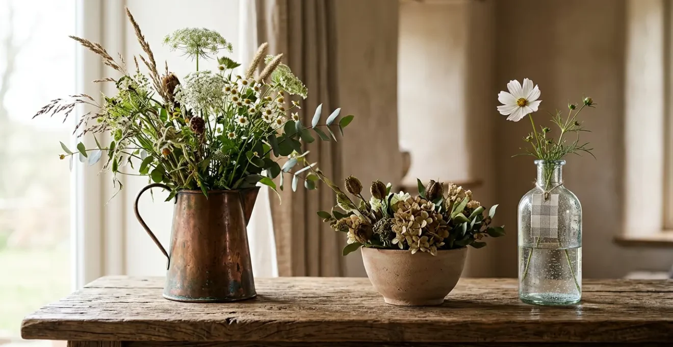
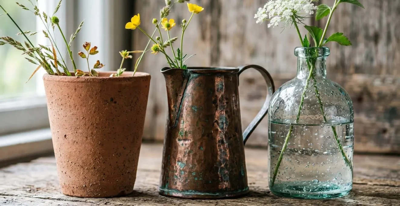
The vessel is the foundation of any floral arrangement, and in rustic design, it’s often the first misstep. While the humble mason jar has its place, relying on it exclusively flattens the aesthetic and screams « DIY » rather than « designed. » To elevate the look, you must think like a stylist, focusing on a curated collection of vessels that provide a rich textural hierarchy. The goal is to create a dynamic interplay of surfaces—matte, reflective, and transparent—that adds depth and sophistication long before a single flower is placed.
This approach moves beyond simple containers and treats the vessels themselves as a form of sculpture. An unglazed ceramic pot offers tactile warmth, aged copper catches the light with a moody glow, and recycled glass provides a sense of airiness and lightness. When grouped, these varied materials create a visual story. They suggest a collection gathered over time, each piece with its own character, rather than a bulk purchase from a single supplier. This is the essence of curated rustic design: making deliberate choices that build layers of interest.
Action Plan: The Three-Texture Vessel Curation Formula
- Step 1: Select one matte-textured vessel – Choose unglazed ceramic, terracotta, or rough stoneware for tactile warmth and organic grounding.
- Step 2: Add one reflective vessel – Incorporate aged copper, mercury glass, or vintage brass to catch light and create visual depth.
- Step 3: Include one transparent/translucent vessel – Use recycled glass, seeded glass bottles, or clear vintage jars to provide airiness and balance.
- Step 4: Vary vessel heights dramatically – Create visual rhythm by pairing tall slender forms with low wide-mouthed bowls.
- Step 5: Arrange asymmetrically – Position vessels at different depths and angles to create movement rather than static symmetry.
As you can see, the combination of different materials, sheens, and heights creates immediate visual intrigue. This curated clash of textures is what gives the arrangement a high-end, professionally styled feel. It’s a foundational principle that elevates the entire tablescape.
Antlers and Feathers: How to Add Wilderness Elements Tastefully?
Incorporating elements from the wilderness, like antlers, feathers, or interesting branches, can be a powerful way to anchor the rustic theme. However, this is where the line between tasteful and tacky is at its thinnest. The key is restraint and purpose. Instead of scattering these items, treat each one as a piece of sculpture. A single, beautifully shaped antler placed artfully on a mantle or a few pheasant feathers tucked into a napkin ring makes a stronger statement than a dozen strewn across a table.
The goal is not to replicate a forest floor, but to evoke a feeling. This aligns with the principles of biophilic design, which focuses on the psychological benefits of connecting with nature. As noted in recent research, even subtle natural elements can have a profound impact. As a study on the topic explains, the presence of natural elements in a built environment is proven to have positive effects on wellbeing.
Biophilic design elements such as natural lighting, greenery, and organic textures, have been shown to reduce stress, enhance cognitive function, accelerate healing, and promote overall well-being and environmental sustainability within the built environment.
– Zhong, Schröder, & Bekkering, Research on Biophilic Design Integration
Therefore, the question to ask is not « How many antlers can I add? » but « What single element can I place here to create a moment of natural beauty? » Think of it as a quiet nod to the wild, not a loud declaration. The most luxurious designs use these elements to create focal points that draw the eye and invite contemplation, demonstrating a deep respect for the natural object itself.
How to Arrange Store-Bought Flowers to Look Like Wildflowers?
The allure of a wildflower bouquet is its effortless, « just-gathered-from-the-meadow » charm. The irony is that achieving this look requires significant technique, especially when working with store-bought flowers. A truly successful « wildflower » arrangement is a triumph of intentional imperfection. It’s about mimicking nature’s randomness through deliberate choices in variety, height, and placement. Many professionals, like the team at Floret Flowers, have perfected this art.
Case Study: Floret Flowers Wildflower Centerpiece Method
Floret Flowers demonstrates their professional technique for creating wildflower-style centerpieces using cultivated blooms. The method emphasizes starting with a crumpled chicken wire base for stem anchoring, building a foliage framework first, then strategically placing focal blooms like garden roses and cosmos. The key differentiator is intentional asymmetry and varied stem heights, with elements kept low and horizontal for table settings. This approach transforms store-bought flowers into arrangements that evoke the delicate, relaxed aesthetic of foraged wildflowers while maintaining structure and longevity.
To replicate this professional technique, you need a formula. It’s not about just mixing colors, but about combining different floral « jobs »—the thriller, the filler, and the spiller—to create a balanced yet dynamic composition. This structured approach is what allows for the appearance of organic spontaneity.
- Ingredient 1 – The Thriller: Select 2-3 standout focal blooms like roses, lisianthus, or cosmos. Position these where they’ll have maximum visual impact, threading them through the arrangement at varying heights.
- Ingredient 2 – The Filler: Deconstruct traditional filler materials. Use baby’s breath in airy wisps (not dense clusters), or incorporate foraged grasses and unexpected textures like raspberry leaves or fern fronds.
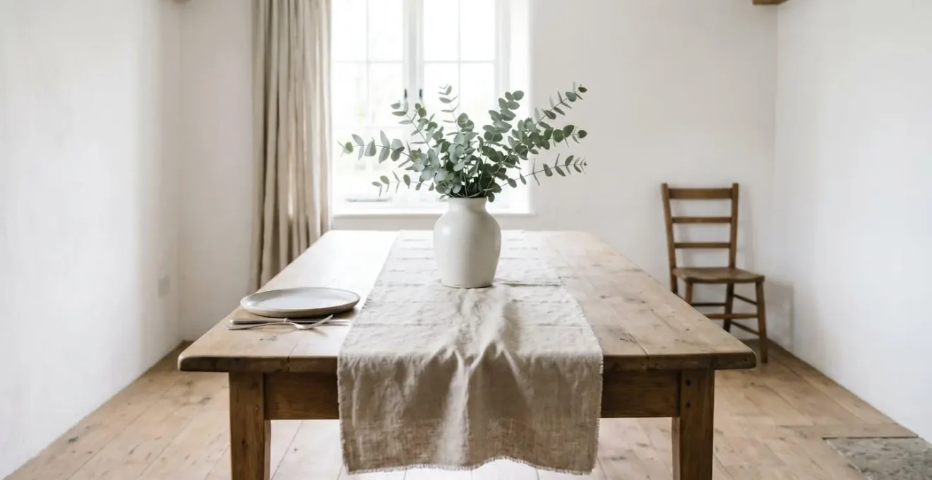
- Ingredient 3 – The Spiller: Add trailing greenery like eucalyptus, or use delicate branches from fruit trees that cascade over the vessel edge to create movement and a gathered-from-nature aesthetic.
- Technique 4 – Embrace Imperfection: Intentionally vary stem heights dramatically, leave some foliage on stems above the waterline, and mix fully bloomed flowers with unopened buds to mimic nature’s life cycle.
- Technique 5 – Create Foliage Framework First: Begin by building a loose greenery base using chicken wire or a flower frog for support, then add focal blooms, ensuring low horizontal placement so arrangements don’t obstruct conversation.
By following these steps, you are no longer just arranging flowers; you are composing a small piece of art that tells a story of a walk through a wild field, even if its components came from the cooler of a grocery store.
The Texture Mistake: Using Too Much Burlap in 2024
Burlap has become the ultimate crutch of rustic decor, and it’s the fastest way to date your event. While it has an authentic agricultural origin, its overuse has rendered it a cliché. The primary issue is textural: burlap is a coarse, light-absorbing material that can make a tablescape feel flat, heavy, and one-dimensional. The move towards a more elevated rustic style involves replacing this default texture with more sophisticated, light-reflecting alternatives. As decor experts often advise, quality trumps quantity.
One beautiful linen runner looks better than five cheap burlap strips. A few well-placed pillar candles look better than 30 scattered tea lights.
– ThePerfectWedding.com Decor Experts, Rustic Wedding Decor Style Guide
The sophisticated alternative is to think in layers and prioritize materials with a more refined hand-feel and visual appeal. Consider raw-edged Belgian linen, cheesecloth, or natural cotton. These fabrics drape beautifully, possess a subtle, organic texture, and interact with light in a much more dynamic way. They add softness and elegance without sacrificing the natural feel. The goal is to create a textural dialogue: the smoothness of a ceramic plate against the soft weave of a linen napkin, the roughness of a wooden table seen through a sheer cheesecloth runner. This is where the magic lies—in the subtle contrasts that engage the senses.
By consciously editing out the burlap and introducing finer textiles, you immediately lift the entire aesthetic. It’s a simple swap that signals a shift from a generic rustic theme to a personally curated and luxurious farmhouse style. It’s a testament to the power of choosing quality over cliché.
Poppies and Daisies: How to Keep Fragile Wildflowers Alive for a Wedding?
Using true wildflowers or delicate, wildflower-like blooms such as poppies and daisies is the ultimate commitment to the authentic rustic aesthetic. However, their ephemeral nature is both their charm and their challenge. Unlike hardy commercial roses, these flowers can wilt dramatically if not handled with professional-level care. Keeping them vibrant through a day-long event requires a strict conditioning process that begins days before the wedding.
Florists have a precise timeline for this, ensuring each delicate stem is fully hydrated and prepared to last. This involves more than just plopping them in water; it includes techniques like searing stems to seal in sap and using specific support mechanics to ensure a constant water source. It’s a science as much as an art, and it’s not a step to be overlooked if you want your arrangements to look as fresh at the end of the night as they did at the beginning.
Here is a professional florist’s conditioning timeline for fragile blooms:
- Day -3 (72 hours before): Cut stems at a fresh 45-degree angle. For poppies specifically, sear stem ends with a flame or dip in boiling water for 10 seconds to seal sap. Never remove stems after inserting into foam as this creates air pockets.
- Day -2 (48 hours before): Place conditioned stems in deep hydration in a cool, dark place. Add flower food to water. Change water daily and keep arrangements away from fruit which emits ethylene gas that ages flowers.
- Day -1 (24 hours before): Create final arrangements using well-disguised floral foam or flower frogs for a constant water supply. For bouquets, use tiny water vials hidden within stems or wrap stem bases in soaked cotton secured with floral tape.
- Wedding Day Morning: Refrigerate arrangements if possible to slow wilting. Mist delicate petals lightly with water. Understand that fragile wildflowers typically last 3 days on average – setting realistic expectations is key.
- Embrace Wabi-Sabi Philosophy: Mix hardy flowers with fragile ones. Accept that a slight, graceful wilt by evening can be beautiful and romantic, embodying the Japanese concept of Wabi-Sabi—beauty in imperfection and the ephemeral nature of the celebration.
Ultimately, a key part of using fragile flowers is a philosophical one. Embracing the Wabi-Sabi concept allows you to see the beauty in a flower’s natural life cycle. A slight, graceful droop by the end of the evening can be seen not as a failure, but as a romantic, poignant reflection of a beautiful day coming to a close.
Why Do Asymmetrical Bouquets Look Better in Farmhouse Interiors?
The perfect symmetry of a tight, round bouquet can feel stiff and out of place in a farmhouse setting. In contrast, an asymmetrical arrangement—with its cascading greenery and varied heights—feels right at home. The reason for this lies in the very soul of the farmhouse aesthetic. Farmhouse interiors are built on a foundation of « found » character, organic materials, and an appreciation for imperfection. An asymmetrical bouquet mirrors this architectural and philosophical DNA.
Case Study: Farmhouse Architecture and the Psychology of Asymmetry
Analysis of modern farmhouse architecture reveals that asymmetrical design elements—including varied window placement and off-center features—are fundamental to the aesthetic. These spaces are defined by character, like exposed beams that aren’t perfectly centered. An asymmetrical bouquet creates a visual dialogue with this organic structure. In nature, perfect symmetry is rare; our brains associate asymmetry with authenticity. A cascading arrangement draws the eye, integrating the bouquet into its environment rather than creating a formal, out-of-place element.
Interior designers have long understood this principle. A room with perfect, mirrored symmetry can feel impersonal and static. Asymmetry, when balanced, creates interest, movement, and a sense of relaxed sophistication. It feels more personal and curated. As the design experts at Havenly note, this is a hallmark of high-end design.
Asymmetrical (yet balanced) rooms are among the most interesting, unique, and high-end spaces. Too much symmetry —mirroring everything — can be off-putting and even feel a bit impersonal.
– Havenly Interior Designers, Asymmetrical Balance in Interior Design Guide
An asymmetrical bouquet does the same job on a smaller scale. It has a « front » and « back, » it encourages the viewer’s eye to travel, and it feels like a living, breathing part of the decor. It doesn’t just sit; it interacts with the space around it. This is why it looks so much better in a farmhouse interior—it speaks the same language of organic, balanced, and beautiful imperfection.
Ferns or Grasses: Which Filler Adds More Movement to Wild Bouquets?
When creating a « wild » bouquet, the filler is just as important as the focal flowers. It’s the element that creates the sense of movement and airiness. The two primary choices for this role, ferns and grasses, offer distinct personalities and create very different types of movement. Choosing between them—or, for advanced arrangers, combining them—depends entirely on the specific emotion and visual effect you want to achieve. Ferns offer a delicate, fluttering motion, while grasses provide a more dramatic, sweeping gesture.
Understanding these nuances is key to controlling the final look and feel of your arrangement. A detailed comparison, as shown in a recent analysis of modern arranging techniques, can help guide your selection.
| Characteristic | Ferns | Grasses (Ornamental) |
|---|---|---|
| Movement Type | Delicate, fluttering, trembling | Sweeping, arching, swaying |
| Visual Weight | Light, airy, soft texture | Linear, dramatic, structural |
| Best Placement | Base of arrangement for low-level texture | Top of arrangement for height and windswept effect |
| Personality Expression | Woodland, gentle, intricate detail | Prairie, wild, bold gesture |
| Examples | Maidenhair fern, leather fern, asparagus fern | Fountain grass, pampas grass, foxtail grass |
| Longevity in Vase | Moderate (can dry gracefully) | Excellent (maintains structure as it dries) |
| Expert Combination Strategy | ||
| Use ferns at base for soft texture + tall grasses at top for height = multi-layered dynamic composition with ultimate movement | ||
Ultimately, there is no single « better » option. The most sophisticated arrangements often use both. A base of soft ferns provides a lush, textured foundation, while a few strategically placed blades of ornamental grass shoot upwards, creating that coveted windswept look. This combination creates a multi-layered composition with a dynamic sense of visual dialogue, capturing the untamed beauty of a truly wild landscape.
Key Takeaways
- Curation Over Collection: The key to an elevated rustic look is intentional editing. It’s about what you choose to leave out as much as what you include.
- Texture is Everything: Move beyond burlap. Layering sophisticated textures like matte ceramic, reflective metal, and soft linen creates visual depth and a high-end feel.
- Embrace Imperfection: From the authentic patina of a vintage bowl (Wabi-Sabi) to the organic shape of an asymmetrical bouquet, true rustic elegance lies in balanced, intentional imperfection.
How to Achieve the Rustic Farmhouse Look Without Being Kitsch?
We’ve arrived at the heart of the matter: how to distill the rustic farmhouse aesthetic to its elegant essence, leaving behind the kitsch. The answer is not a checklist of items to buy, but a set of principles to guide your choices. It is a mindset of curation, not accumulation. As leading wedding experts state, it all comes down to one core concept.
The difference between rustic and messy is intentionality. A rustic table with mismatched vintage plates, linen napkins, and wildflowers in a mason jar looks curated because someone chose every element.
– ThePerfectWedding.com Decor Experts, Rustic Wedding Decor Ideas: Natural Elegance
This intentionality can be broken down into actionable principles that serve as a filter for every decor decision. These principles force you to prioritize authenticity, edit ruthlessly, and think beyond the purely visual. They are the antidote to the faux-weathered signs and meaningless trinkets that define rustic kitsch.
To avoid the kitsch trap, internalize these anti-kitsch principles:
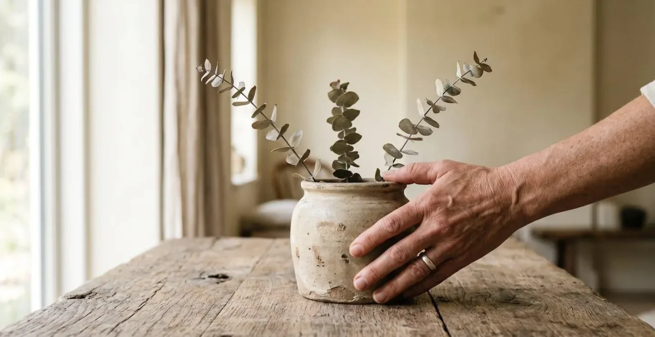
- Principle 1 – Wabi-Sabi Over Fake Distressing: Honor genuine wear and imperfection. Choose an old wooden bowl with authentic patina over new items with artificial ‘distressed’ paint. Authenticity cannot be faked—seek items with real history and natural aging.
- Principle 2 – The ‘One In, Two Out’ Curation Rule: For every new rustic element you add, remove two items. This forces ruthless editing and prioritizes negative space—the hallmark of sophisticated design versus cluttered kitsch.
- Principle 3 – Engage All Senses, Not Just Sight: Create a sensory experience. Consider scent (beeswax candles, linen), sound (textiles that absorb noise), and touch (natural linen, smooth stone). This elevates decorating to world-building.
- Principle 4 – Function and Story Over Decoration: Kitsch involves decorative items with no purpose (fake barn doors). Anti-kitsch prioritizes authentic items with function or a genuine narrative. Use a real sliding barn door or vintage tools with history. If an item is both beautiful and useful, it transcends kitsch.
By applying these four principles, you build a space that feels authentic, personal, and deeply resonant. You create an environment that tells a story, engages the senses, and exudes a quiet confidence. This is the ultimate expression of rustic luxury—a style that is felt, not just seen.
Your journey to a perfectly curated rustic event begins not with a shopping list, but with a clear vision and a commitment to intentionality. Begin today by applying these principles of curation, texture, and authenticity to a single corner of your space or one element of your event plan. The transformation from cluttered to curated is within your reach.