Mastering floral artistry isn’t about following prescriptive rules, but about understanding the visual physics of harmony governed by the Golden Ratio.
- This universal principle (1.618) dictates not only height and proportion but also the distribution of visual weight, color, and even negative space.
- Concepts like the S-Curve, asymmetrical balance, and textural contrast are all practical applications of this mathematical constant for creating dynamic, natural-looking compositions.
Recommendation: Begin by consciously analyzing the proportions in your work, but recognize that true artistry emerges when you can intuitively feel—and even intentionally break—these principles for emotional effect.
Many aspiring floral designers and serious hobbyists share a common frustration: creating an arrangement that, despite having beautiful flowers, simply feels « off. » The balance is askew, the proportions seem stunted, or the overall composition lacks the effortless grace seen in professional work. The internet offers a plethora of quick tips— »use an odd number of stems, » « place your largest flower in the center, » or « ensure your bouquet is 1.5 times the vase height. » While not incorrect, these are merely symptoms of a much deeper, more universal principle.
The true key to unlocking harmonious design lies not in memorizing rules, but in understanding the foundational theory behind them. This is the realm of the Golden Ratio, also known as Phi (approximately 1.618). Far from being an arbitrary number, this ratio appears throughout the natural world, from the spiral of a seashell to the branching of a tree, and our eyes are inherently programmed to find it pleasing. It is the silent, mathematical underpinning of what we perceive as beauty and balance.
This guide moves beyond simplistic instructions to deconstruct the visual physics of floral design. We will explore how the Golden Ratio is not a rigid rule to be mechanically applied, but a foundational principle that, once understood, allows the floral artist to intuitively manipulate proportion, weight, color, and line. By mastering this theory, you can learn to create not just beautiful, but emotionally resonant compositions that guide the viewer’s eye and feel organically complete.
This article will dissect the core components of floral artistry through the lens of the Golden Ratio. By exploring these structured principles, you will gain the theoretical framework needed to elevate your arrangements from simple bouquets to sophisticated works of art.
Summary: A Structural Guide to the Golden Ratio in Floral Design
- Why Do Dark Flowers Need to Be Placed Lower in an Arrangement?
- How to Use the Color Wheel to Create Harmonious Floral Palettes?
- Symmetry or Asymmetry: Which Layout Suits a Traditional Mantelpiece?
- The Vase Height Error That Makes Your Bouquet Look Stunted
- How to Mix Rough and Smooth Textures for Professional Depth?
- How to Create the ‘S’ Curve Line in Classical Arranging?
- Why Is Less More When Styling Modern Coffee Tables?
- What Distinguishes Successful Floral Artistry from Simple Arranging?
Why Do Dark Flowers Need to Be Placed Lower in an Arrangement?
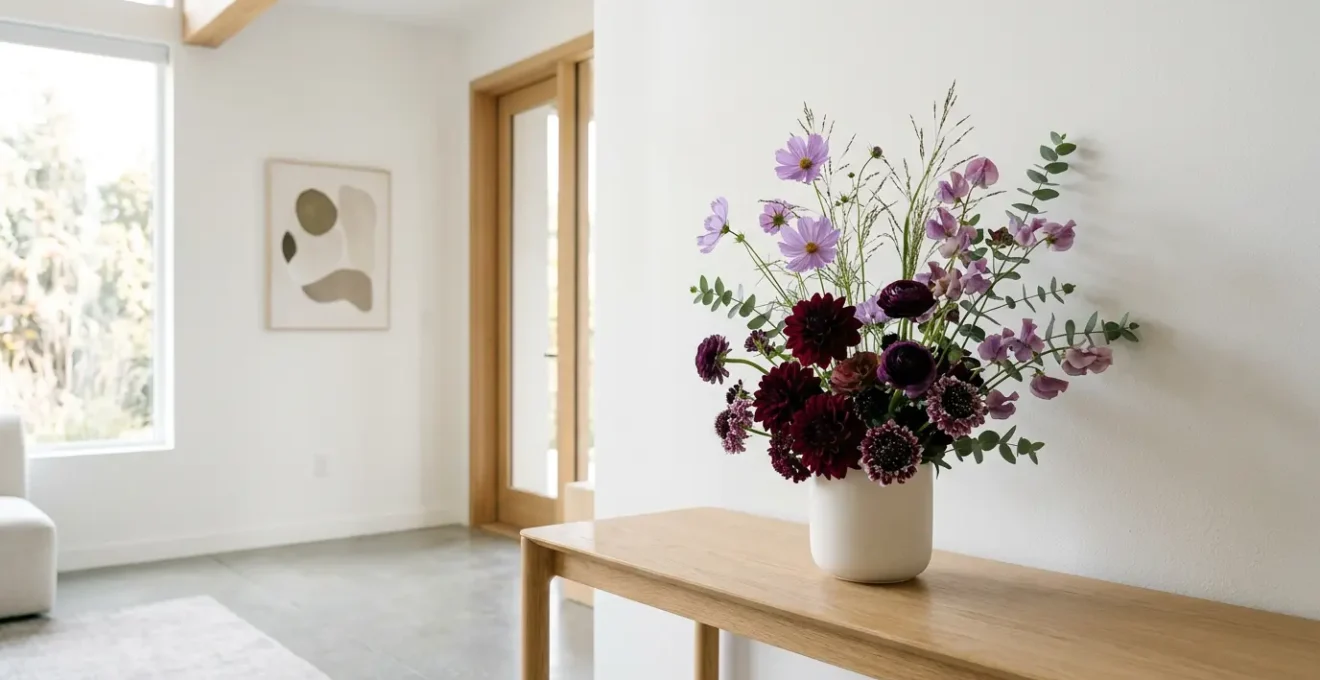
The placement of dark flowers is not an arbitrary rule but a direct application of the principle of visual weight. In design theory, some elements appear « heavier » than others, and color is a primary determinant of this effect. Dark, saturated colors like deep burgundy, navy, or forest green possess a greater visual gravity than light, airy colors like white, pale pink, or yellow. Consequently, placing these visually heavy elements lower in an arrangement provides a sense of stability and grounding. It creates a subconscious feeling of balance, as if the composition is firmly rooted and will not topple over.
Think of it as a form of visual physics. Just as a sculptor places a heavier base on a statue, a floral artist uses dark colors to anchor the design. Placing a large, dark dahlia at the top of a delicate arrangement would create a top-heavy, precarious feeling, inducing a subtle tension in the viewer. By positioning it near the base or the center of the arrangement’s mass, you create a stable foundation from which lighter, more delicate elements can emerge and soar. This technique is crucial for establishing a clear visual hierarchy and guiding the eye naturally from the anchor point upwards and outwards.
This principle of visual weight is fundamental to achieving balance, whether your design is symmetrical or asymmetrical. For a student of design, mastering this concept involves moving from « placing dark flowers at the bottom » to « distributing visual mass to achieve equilibrium. » This theoretical shift is the first step toward creating more sophisticated and intentionally balanced compositions.
How to Use the Color Wheel to Create Harmonious Floral Palettes?
The color wheel is an essential tool for any designer, serving as a map to the relationships between hues. In floral artistry, it allows for the intentional creation of mood and harmony. The most fundamental relationships are analogous and complementary. As noted by floral design experts, these pairings create distinct emotional responses. As Team Flower Education explains in their guide, the choice between harmony and vibrancy is a strategic one.
Hues next to each other on the wheel (analogous colors) will create a soothing effect. Tones opposite each other on the wheel (complementary colors) will bring out each other’s vibrance.
– Team Flower Education, Diving into the Flower Color Wheel
An analogous palette, using colors adjacent on the wheel (e.g., yellow, yellow-orange, and orange), produces a gentle, cohesive, and naturally serene look. This is often seen in monochromatic or layered tonal arrangements. Conversely, a complementary palette, which pairs colors from opposite sides of the wheel (e.g., blue and orange, or purple and yellow), creates high contrast and energy. This dynamism makes each color appear more intense and is excellent for creating a bold focal point.
The Golden Ratio enters color theory through distribution and mass. A common application is a 60-30-10 rule, a simplified version of proportional harmony. A more sophisticated approach uses the Golden Ratio directly, allocating roughly 62% of the visual space to a dominant color, and 38% to secondary and accent colors. This creates a balanced yet dynamic palette that avoids the static feel of a 50/50 split. The most intense or contrasting color is often used in the smallest proportion at the focal point, drawing the eye exactly where the artist intends.
Symmetry or Asymmetry: Which Layout Suits a Traditional Mantelpiece?
The choice between symmetry and asymmetry for a traditional mantelpiece depends entirely on the desired aesthetic: classical formality or organic dynamism. A symmetrical arrangement, where one side is a mirror image of the other, evokes a sense of order, tradition, and calm. This approach aligns perfectly with classical architecture and formal interior design. For a traditional mantelpiece flanked by identical objects, a symmetrical floral layout will reinforce the room’s inherent stability and formal grace. It is predictable, balanced, and visually restful.
However, asymmetry often provides greater visual interest and a more contemporary, natural feel. This is where understanding dynamic equilibrium becomes paramount. An asymmetrical design is not unbalanced; rather, it achieves balance through the careful distribution of visual weight, rather than through mirroring. A large, dominant flower on the left might be balanced by a spray of smaller blooms and textured foliage on the right. The overall visual mass on each side of the central axis is equal, but the components are different. This creates movement and a visual pathway for the eye to follow, lending a sense of life and spontaneity to the piece.
Case Study: Asymmetrical Balance in Professional Floral Design
Asymmetrical balance has become a hallmark of modern floral design, creating an organic, relaxed look. As detailed in a study of basic floral arrangement rules, instead of identical matching, asymmetrical arrangements achieve equilibrium through equal visual weight distributed differently. For example, placing a large focal flower on one side can be balanced with several smaller flowers or extended foliage on the other. This technique creates a dynamic and interesting composition that feels spontaneous while maintaining perfect visual stability.
For a traditional mantelpiece, a symmetrical design is the historically congruent and safe choice. However, a carefully constructed asymmetrical arrangement can introduce a sophisticated, artistic tension that elevates the space, preventing it from feeling static or dated. The decision hinges on whether the goal is to reinforce tradition or to artfully contrast with it.
The Vase Height Error That Makes Your Bouquet Look Stunted
One of the most common mistakes in floral arranging is an incorrect proportion between the flowers and the vase, resulting in a composition that looks either stunted or unstable. The widely cited guideline that avoids this is a direct, practical application of the Golden Ratio. As a general rule, the height of flowers is around 1.5 to 2 times the height of the vase. This 1.5x proportion is a simplified, user-friendly approximation of the Golden Ratio (1.618). Following this guideline ensures that the arrangement has enough height to feel elegant and expansive, while the vase remains a stable, proportional anchor.
When the flowers are too short (e.g., only as tall as the vase), the arrangement appears compressed and crowded, with the blooms seeming to sink into the container. Conversely, if the flowers are excessively tall (e.g., three or four times the vase height), the composition looks precarious and top-heavy, and the visual connection between the vessel and the botanicals is lost. The 1.618 ratio creates a point of proportional harmony where the two elements, vase and flowers, form a single, cohesive visual unit.
However, this ratio is a principle, not a rigid law. The ideal proportion can be adapted based on the style of the vase and the desired effect, as shown in a comparative analysis of vase types. Understanding these variations allows the designer to make intentional choices.
| Vase Type | Recommended Flower Height Ratio | Visual Effect | Example |
|---|---|---|---|
| Tall Vase (Standard) | 1.5 to 2x vase height | Tall and dramatic, traditional elegance | 10-inch vase = 15-20 inch stems |
| Small/Fish Bowl Vase | 1.5x vase height | Lush and full, compact arrangement | 6-inch bowl = 9-inch stems |
| Wide/Low Vase (Bowl) | 1.618x vase width (Golden Ratio) | Balanced proportions for horizontal spread | 6-inch wide opening = 10-12 inch spread |
| Cube Vase | Match vase height (1:1 ratio) | Compact, modern, bulky blooms | 5-inch cube = 5-inch stem cut |
By internalizing the Golden Ratio as the « why » behind the « 1.5x » rule, a designer can confidently adapt to any vessel, ensuring every arrangement feels naturally and beautifully proportioned.
How to Mix Rough and Smooth Textures for Professional Depth?
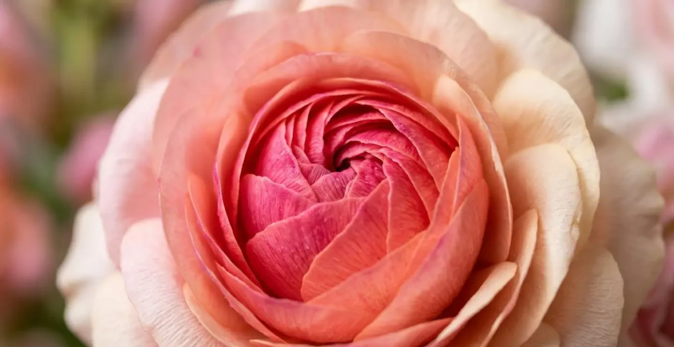
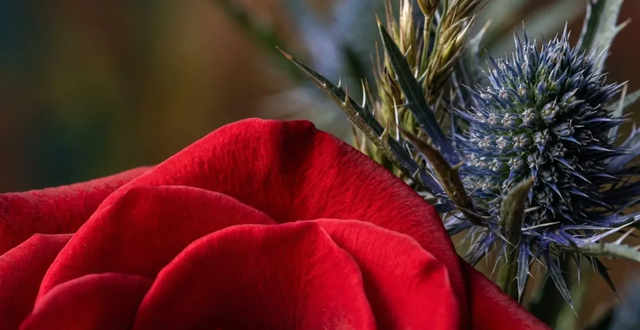
Beyond color and form, texture is the third critical element in sophisticated floral design. It refers to the surface quality of plant materials—smooth, rough, glossy, matte, feathery, or spiky. A composition that uses only one texture, such as an arrangement of all smooth-petaled roses, can appear flat and one-dimensional. Mixing contrasting textures is what creates tactile interest and professional depth, inviting the eye to explore the arrangement more closely. The interplay between a velvety rose petal, a spiky eryngium head, and a glossy galax leaf creates a rich visual narrative.
The principle is one of contrast. Just as complementary colors create vibrancy, contrasting textures create energy and definition. The smoothness of a tulip or calla lily is amplified when placed next to the rough, matte texture of pampas grass or the intricate structure of a succulent. This juxtaposition creates a visual pathway, leading the eye from one surface quality to another. This technique is essential for breaking up large masses of a single color and adding a layer of complexity that distinguishes amateur work from professional artistry.
The Golden Ratio can even guide the *amount* of texture used. To avoid a chaotic, overly busy look, a good practice is to establish a dominant texture (approximately 62% of the arrangement, or the 1.618 portion) and then introduce a contrasting accent texture for the remaining 38% (the 1 portion). This creates a harmonious balance where the contrast feels intentional and impactful, not random. The following checklist, based on top tips for using texture, provides a framework for creating this dynamic interplay.
Your Action Plan: Creating Dynamic Textural Contrast
- Juxtapose Soft vs. Hard: Pair billowy elements like dahlias or pampas grass with the sturdy, defined shapes of calathea leaves or birch branches to create a pleasing tension.
- Combine Smooth vs. Rough: Integrate velvety surfaces like lamb’s ear with the intricate roughness of curly willow or clusters of succulents to add tactile interest.
- Balance Glossy vs. Matte: Use the light-reflecting quality of glossy tulips or calla lilies against the light-absorbing matte surfaces of thistle or dry grasses to control how light interacts with your design.
- Mix Feathery vs. Structured: Create a journey for the eye by blending light, airy elements like ferns or astilbe with the bold, architectural forms of structured blooms.
- Apply the Layering Principle: Establish a primary texture to make up the larger mass of the design (the 1.618 portion), then strategically add smaller amounts of a contrasting texture (the 1 portion) as accents.
How to Create the ‘S’ Curve Line in Classical Arranging?
The ‘S’ Curve, also known as the « Line of Beauty » or the Hogarth Curve, is one of the most elegant and dynamic lines in classical design. Named after the 18th-century English artist William Hogarth, who theorized it was the basis of all beauty, this serpentine line creates a sense of movement, grace, and life. Unlike static vertical or horizontal arrangements, the S-Curve leads the eye along a gentle, flowing path through the entire composition. Its inherent grace comes from its foundation in the Golden Ratio; it is essentially an asymmetrical line that achieves perfect dynamic equilibrium.
The structure of the S-Curve is composed of two opposing curves of unequal length. The dominant, longer curve (the 1.618 portion) typically sweeps upwards, while a smaller, counterbalancing curve (the 1 portion) descends in the opposite direction. This unequal proportion is what gives the line its natural, organic feel, preventing the stiff formality of two identical curves. The focal point of the arrangement, usually the largest or most vibrant bloom, is placed at the nexus where these two curves meet, serving as the visual anchor from which the movement originates.
Building an S-Curve requires a structured approach, starting with a framework of flexible materials and layering from there. The following steps outline the process:
- Establish the Skeleton: Begin by using pliant foliage like eucalyptus, leatherleaf fern, or curly willow to create the foundational S-shaped framework. Define the dominant upper curve and the smaller lower curve.
- Apply the Golden Ratio to Proportions: Ensure one curve is visibly longer and more sweeping (the 1.618 portion) than the other (the 1 portion) to create a natural, asymmetrical balance.
- Position the Focal Flower: Place your most eye-catching bloom at the key intersection where the two curves meet, typically about one-third of the way into the arrangement, to act as the visual anchor.
- Create Natural Spiral Movement: As you add more stems, cross them at a diagonal and rotate the vase. This builds a layered, airy structure that follows a natural spiral pattern.
- Establish a Visual Pathway: Use color and size to reinforce the S-curve. Allow colors to soften or blooms to get smaller as they move away from the focal point along the line of the curve.
Mastering the S-Curve is a significant step in transitioning from a novice to an advanced floral artist, as it demonstrates a deep understanding of line, movement, and dynamic balance.
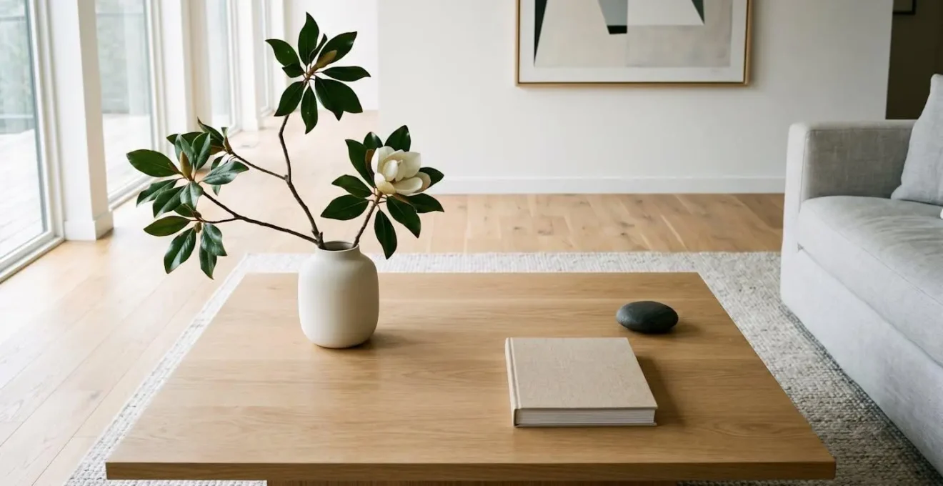
Why Is Less More When Styling Modern Coffee Tables?
In modern and minimalist design, the principle of « less is more » is paramount. This philosophy extends directly to floral styling, especially in a central, highly visible space like a coffee table. Here, the arrangement itself is only one part of the composition; the empty space around it, known as negative space, is an equally important, active design element. The goal is not to fill the surface, but to create a single, impactful statement where both the object and the space around it are in perfect harmony. This is where the Golden Ratio finds one of its most subtle and powerful applications.
Instead of a dense, cluttered arrangement, modern styling favors a single, sculptural piece—perhaps one dramatic branch of orchid, a few perfect calla lilies, or an architectural arrangement of monstera leaves. This singular object becomes the focal point. The Golden Ratio then dictates its placement. By positioning the arrangement asymmetrically on the table—for instance, at a point one-third of the way across the surface—you create a relationship between the object (the ‘1’ portion) and the negative space (the ‘1.618’ portion). This intentional imbalance feels dynamic and sophisticated, drawing the eye to the arrangement while allowing the overall composition to « breathe. »
This concept is articulated perfectly by design experts who work with scale and space. As floral designer Christina Yan notes, the space itself is a critical component of the design.
In modern design, the empty space around the arrangement is as important as the arrangement itself. The ratio of ‘object’ to ‘space’ should feel intentional, approaching the 1:1.618 ideal.
– Christina Yan, Tips For Designing In Large Vases – Florists’ Review
A coffee table cluttered with multiple items creates visual noise. A table with a single, well-placed, and proportionally balanced floral element creates a serene, contemplative focal point. It demonstrates confidence and a deep understanding that what you choose to leave out is just as important as what you choose to put in.
Key Takeaways
- The Golden Ratio (1.618) is not a rigid rule but a foundational principle of visual harmony that governs proportion, balance, and flow in floral design.
- This ratio applies to all aspects of an arrangement, including vase-to-flower height, the distribution of color and texture, and the relationship between objects and negative space.
- True artistry involves moving from mechanically applying these principles to intuitively understanding them, knowing when and how to bend the rules to create a specific emotional effect.
What Distinguishes Successful Floral Artistry from Simple Arranging?
The transition from a competent floral arranger to a true floral artist lies in the shift from mechanical application to intuitive understanding. An arranger follows rules; an artist manipulates principles. An arranger can create a technically correct bouquet by following the 1.5x height rule and placing dark flowers at the bottom. An artist, however, understands that these « rules » are simply expressions of the Golden Ratio and the physics of visual weight. This deeper knowledge grants them the freedom to not only follow the principles but, more importantly, to know when and how to break them for emotional impact.
This is the concept of intentional dissonance. An artist might deliberately place a dark flower high in a composition to create a feeling of drama or tension. They might stretch a proportion beyond the 1.618 ideal to achieve a sense of exaggerated elegance or whimsy. This rule-breaking is not a mistake; it is a conscious, controlled decision made to evoke a specific feeling in the viewer. As the Floral Design Institute aptly describes, this is the leap from technician to artist.
The leap from technician to artist is moving from mechanically applying the rule to intuitively feeling it. Artistry is about controlling emotion. A perfect Golden Ratio arrangement evokes harmony and peace. An artist knows how to slightly ‘break’ the ratio to create tension, drama, or whimsy.
– Floral Design Institute, Principles of Floral Design
Developing this « Golden Eye »—an intuitive sense for harmonious proportions—requires practice and conscious analysis. It involves training your eye to see the underlying structure in both natural and man-made objects. The following exercises can help cultivate this essential artistic skill:
- Use Your Phone’s Rule of Thirds Grid: Apply your phone camera’s built-in grid (a simplification of the Golden Ratio) to critique and photograph your own work from multiple angles, analyzing focal points and balance.
- Analyze Famous Paintings: Study masterworks of art to identify where the Golden Ratio appears in composition, subject placement, and proportional relationships.
- Practice Principle Layering: Create arrangements that seamlessly integrate multiple Golden Ratio applications at once—in height, color, texture, and line—to build a cohesive whole.
- Experiment with Intentional Rule-Breaking: Create a composition that is balanced in every way except for one element. Defy the Golden Ratio in that one area and analyze the emotional effect it creates.
- Document and Reflect: Photograph your arrangements and use simple measurement tools to see how close your intuitive proportions are to the 1.618 ratio, gradually training your eye to recognize harmony instinctively.
Ultimately, floral artistry is storytelling with botanical materials. The Golden Ratio provides the grammar and syntax, but the artist writes the poetry.
Your journey from technician to artist begins now. Start applying these principles of proportion and balance to your next arrangement, and observe how a deeper understanding of theory transforms your creative practice.